Designing and developing PechaKucha’s first iOS app across continents.
"Working with a project manager meant we would always have meetings on a regular cadence, everyone would know when they were happening. We also always knew what our budget was, how much spend we’d gone through. We wouldn’t just be getting a bill at the end."
- Mark Dytham, co-founder of PechaKucha
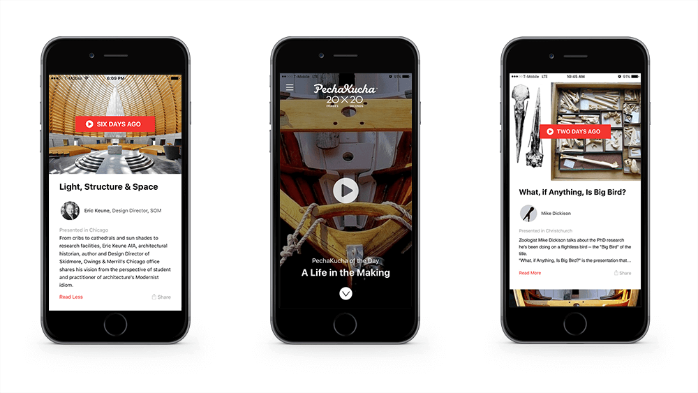
Project Highlights
- We learned how to collaborate with clients halfway across the world, when "traditional" meetings would not do.
- We built an API to leverage the existing platform's back-end so the client would not have to do extra work to manage the app.
- I learned how to actually pronounce "PechaKucha" and why it's called that :)
PechaKucha nights happen in over 1,000 cities.
PechaKucha’s unique presentation structure caught on quickly in the creative community. Each speaker gets 20 images and 20 seconds per image. The slides automatically advance. PechaKucha is not expected to be as polished as TED, it’s real people telling authentic stories in local environments. That, plus a visually rich and engagingly fast format, have helped it grow to just about every major city on earth.
Table XI worked with PechaKucha (also lovingly know as PK) since 2012. When I became their project manager in 2015, my job was to help them build their first mobile app, PechaKucha of the Day.
It’s a lot harder to build trust remotely.
The first solution was to set up a standing meeting with the PechaKucha team. We hit on having the meeting at 7:00 p.m. our time, which was 7:00 a.m. in Tokyo. That way we could get their ideas when they were at their freshest, and we could update them after a full day of progress on the project.
Then we had to solve for showcasing progress on the app in a dynamic way. Screenshots can’t show functionality, and the PechaKucha team couldn’t be there with us in person to view the app in our environment. We ended up using Fabric, an iOS development tool that creates a prototype anyone can download to their phone. That gave the team roughly the same experience users would have, so they could give the most effective feedback.
This is what I did for our friends at PK in Tokyo:
- Collaborated directly with founders
- Managed a small team of designers, mobile developers and Rails developers
- Managed project scope, budget and timeline
- Facilitated regular client showcases for broader PK team
You can read the full case study from Table XI.
Interested in learning more?
Portfolio

CTO at Software ConsultancyConsulting
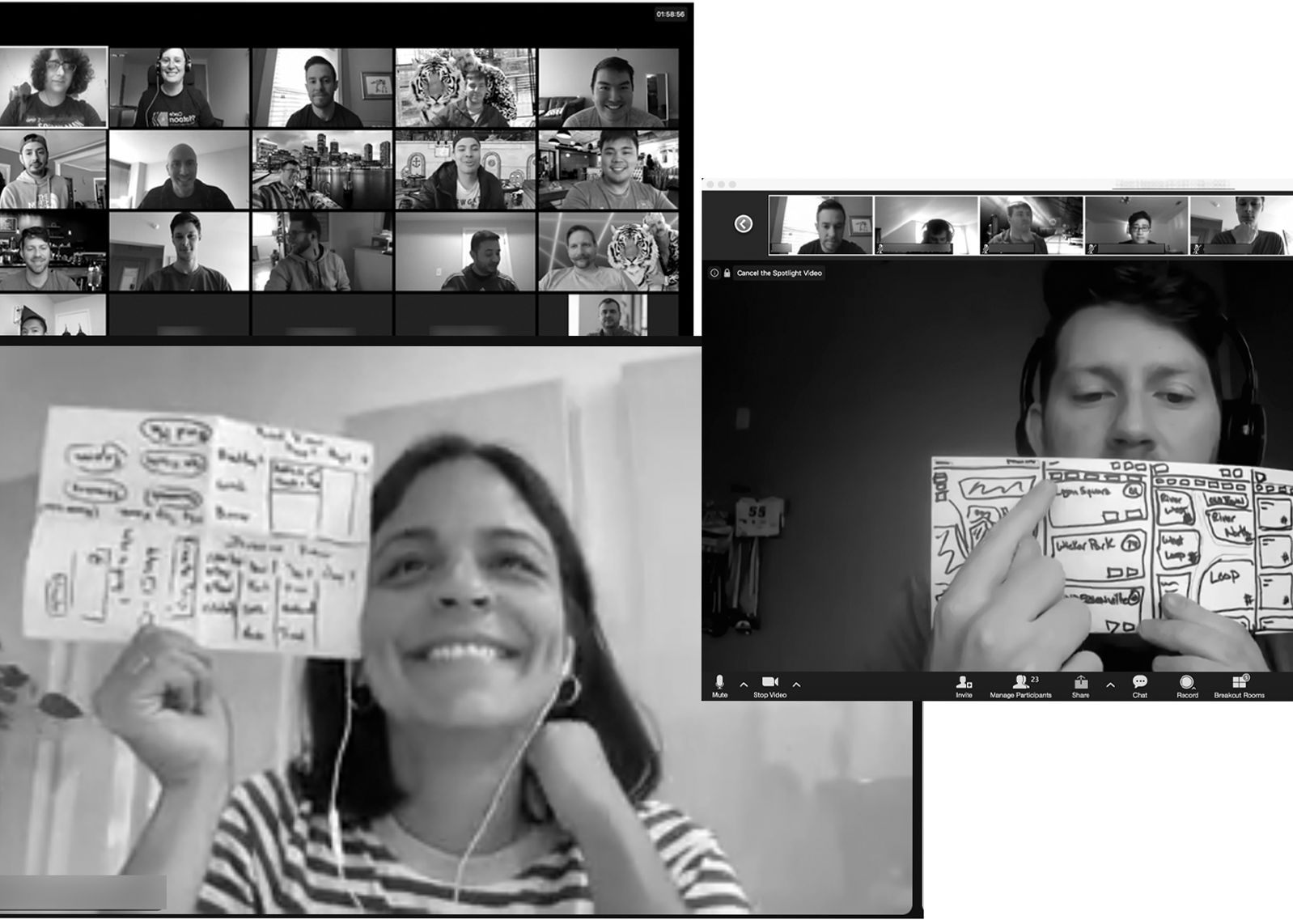
Team Project KickoffWorkshop
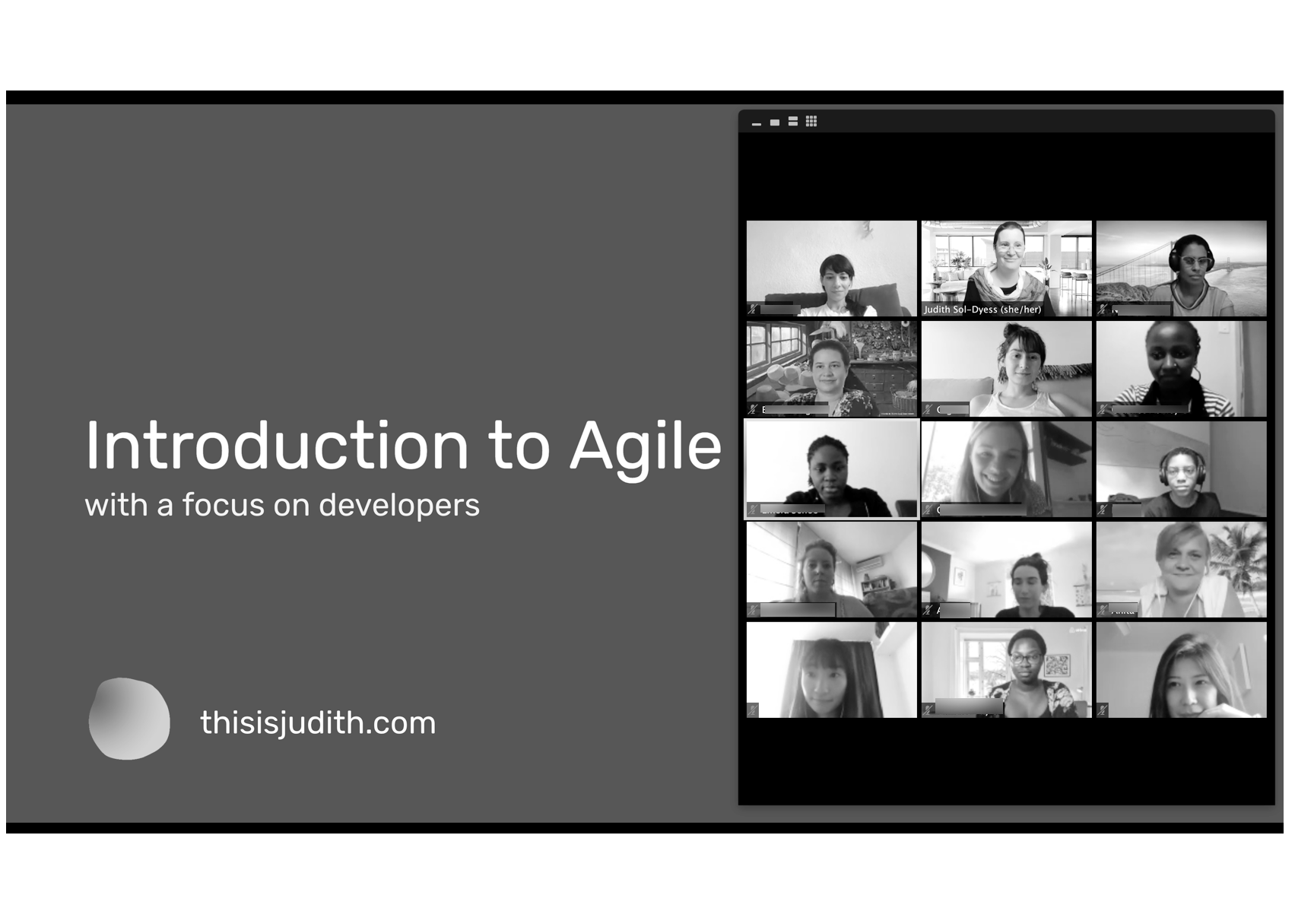
Intro to Agile SessionSession
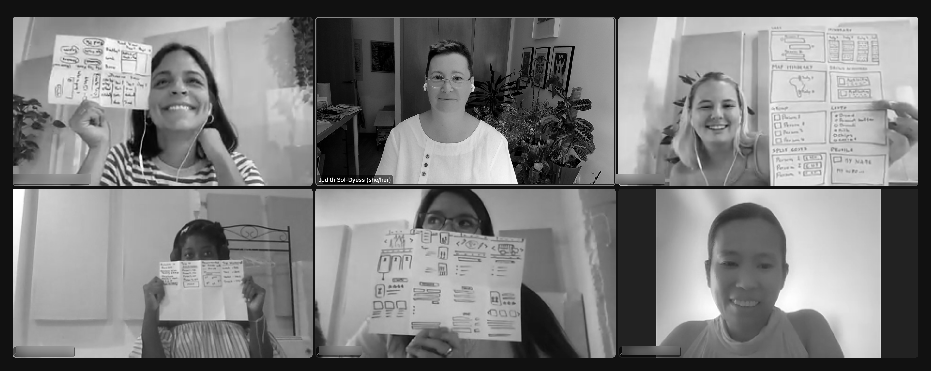
Product Ideation WorkshopWorkshop
Agile Lego WorkshopWorkshop
Google Design SprintsWorkshop

Tyson's Plant Based NuggetsNew Product
PUSH WellnessHealth & Wellness
Chicago IdeasEvents
Rice University ChatbotEducation
WomenOnCallNonprofit
KeiserMarketing
IDC Financial PublishingFinTech
